Structural Analogies
2.2 Relationships between Individual Elements: Harmony and Rhythm
However, painters were interested in music not solely because of its potential for shaping temporal sequences but also because of the finely regulated relationships between individual elements. Thus, as early as 1904, Adolf Hölzel had called for a counterpart in visual art to musical harmonics: I mean, similar to the counterpoint and harmonics that exist in music one must also endeavor in painting to create a specific theory regarding artistic contrasts of every kind and their harmonious equilibrium.[3]
The break with the figurative at the end of the nineteenth century sparked reflection on and redefinition of the inherent value of the materials used in painting and, in the following decade, more concerted efforts at systematization: the principles of the proportionality of color and form were now formulated in analogy to musical art.
Robert Delaunay thus premised his visual idiom on simultaneous contrasts of color. By placing blocks of pure complementary color alongside one another he facilitated simultaneous perception of them, and hoped thereby to provoke an impression of movement in two or three dimensions. He manifested this concept in his series of window paintings (Fenêtres simultanées; 1912) and circular forms (Formes circulaires; as of 1912), and took it up again from 1930 onwards in his rhythm’ paintings (Rythmes). Synchromists Morgan Russell and Stanton MacDonald-Wright employed color rhythms based on color chords in paintings such as Synchromy No. 7 (1914–1915) and Creation Synchromy (1914).
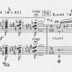
In 1913–1914, Fernand Léger composed what he called form contrasts from cubic and cylindrical forms executed in primary colors.[4] He considered contrast a powerful means of visual expression, analogous to dissonance in music. Franz Marc derived his concept of color dissonance directly from Schoenberg’s Theory of Harmony (1911) and combined it with an organization around the prism, as evident, for example, in Sonatine für Geige und Klavier (Sonata for Violin and Piano; 1913).
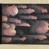
Johannes Itten regarded color as a vertical arrangement analogous to harmony and the development of the graphic line in the horizontal plane as analogous to melody. His deliberations on color drew on Adolf Hölzel’s contrast theory, yet he also went a step further by investigating, in particular, the effects of color on equilibrium, the proportions and degrees of saturation of colors, and their effects on light and space. This is evident in Itten’s Komposition aus zwei Formthemen (Composition of Two Form Themes; 1919), in which he used basic forms, the triangle and circle, to develop a complex interlocking visual structure in which the spectral colors run through the geometric construction in nuanced hues and thereby animate it. Form and color, and texture and depth create a multifaceted visual space. This multidimensional interconnectedness of the pictorial elements, for which Itten coined the term bandräumlich (spatially bound), keeps the viewer’s eye constantly moving.
In order to elucidate their concepts, and especially when it came to naming their works, visual artists referred frequently — mostly in metaphorical terms — to the musical forms and principles of Baroque, Classicism, and Romanticism as a means of communicating the systems that underpinned their compositions.
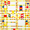
Yet others, including Itten, were drawn to contemporary forms such as the twelve-tone technique, a renunciation of traditional harmonics, or even to ragtime and the cakewalk. Léger created an ink drawing, Jazz (1930), in which the dissonant rhythms of jazz are expressed in the oblique pictorial structure and stark contrast of black and white tones. In his two similarly structured paintings, Broadway Boogie Woogie (1942–1943) and Victory Boogie Woogie (1942–1944), Piet Mondrian interpreted in form and color the syncopated rhythms of jazz and his experience of Manhattan’s bright, flickering lights and rectilinear street grid.

Works: Broadway Boogie Woogie, Circularities, Composition with two coulor schemes, Creation Synchromy, Harmonielehre, Jazz, Rhythm, Sonata for Violin and Piano, Sonatine II (red), Synchromy, Victory Boogie-Woogie, Windowpaintings
People: Robert Delaunay, Adolf Hölzel, Johannes Itten, Fernand Léger, Stanton MacDonald-Wright, Franz Marc, Piet Mondrian, Morgan Russell, Arnold Schönberg